Why a trader cares
Different trades require different evidence. A prompt-crude question should not be forced into the same layout as an LNG-weather question.
The builder uses the same component registry as the primary dashboards, so a saved workspace can combine price, physical, positioning, model, and thesis evidence.
Different trades require different evidence. A prompt-crude question should not be forced into the same layout as an LNG-weather question.
Which evidence should stay together for the decision I am monitoring?
Every screen preserves the instrument, period, unit, source, and limitation while explaining why the evidence matters.
Read the instrument, unit, timestamp, period, and source first. A weekly stock estimate and a five-minute futures quote answer different questions.
The current value matters less without its direction of travel, seasonal baseline, related markets, and the catalyst that moved expectations.
Treat every dataset as evidence with a release lag, methodology, revision risk, and known blind spots. The workflow should be reproducible after the fact.
Definitions stay plain enough to learn from, while the desk read preserves the mechanism, cadence, and source a professional user expects.
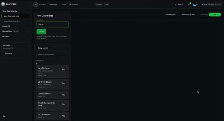
The builder exposes the same maintained cards and charts used in Enerlytics' primary dashboards.
A component is a live view with its own query, methodology, empty state, and entitlement—not a decorative placeholder.
Starting layouts group evidence for crude, natural gas, freight, and cross-market questions.
Templates reduce setup time while leaving the user responsible for removing evidence that does not answer the current question.
Card selection, sizing, order, filters, and dashboard identity are saved for later sessions.
Persistence turns a one-off screen into a repeatable monitoring process and warns before unsaved edits are abandoned.
Compatible components can be aligned to the same commodity, date range, or observation window.
Alignment reduces accidental comparisons between a live quote, a weekly release, and a differently dated physical estimate.
Preserves each component’s own methodology
Supports market-specific layouts and filters
Keeps saved dashboards connected to live data rather than screenshots
Adding more cards does not automatically improve a decision. The strongest dashboard is selective and tied to a clear question.
A useful custom dashboard is a deliberate evidence set, not the maximum number of available cards.
For example: Is prompt WTI tightness broadening into the physical market?
Add price, M1-M2, Cushing, refinery runs, freight, and crude-on-water—not unrelated gas cards.
Place observation first, confirmation second, and monitoring or invalidation last.
Return to the same layout as each source updates.
Builder components reuse the product's existing source labels, freshness rules, units, and explanations so a saved dashboard does not invent a second interpretation layer.
Enerlytics links the underlying methodology so customers can distinguish a product interpretation from the source definition.
Enerlytics publishes weekly market recaps, component explainers, and thesis walkthroughs. For Dashboard Builder, the recurring desk question is: Which compact dashboard best recreates the evidence sequence used in this week's market recap?
Start with a free trial. Review the data, methodology, related evidence, and limitations before making your own market decision.
Start free trial